
A clean look for Viper Slacklines going into 2026. Started in 2017, the rebrand continues to honour Viper’s core values of innovation and freedom, while adding a focus on creative expression and authenticity.
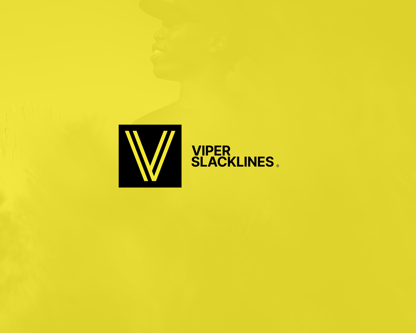
The logomark is a nod towards the brands purpose-made gear. An overlapping of the lines symbolises the slackline while standing as an elegant mark.
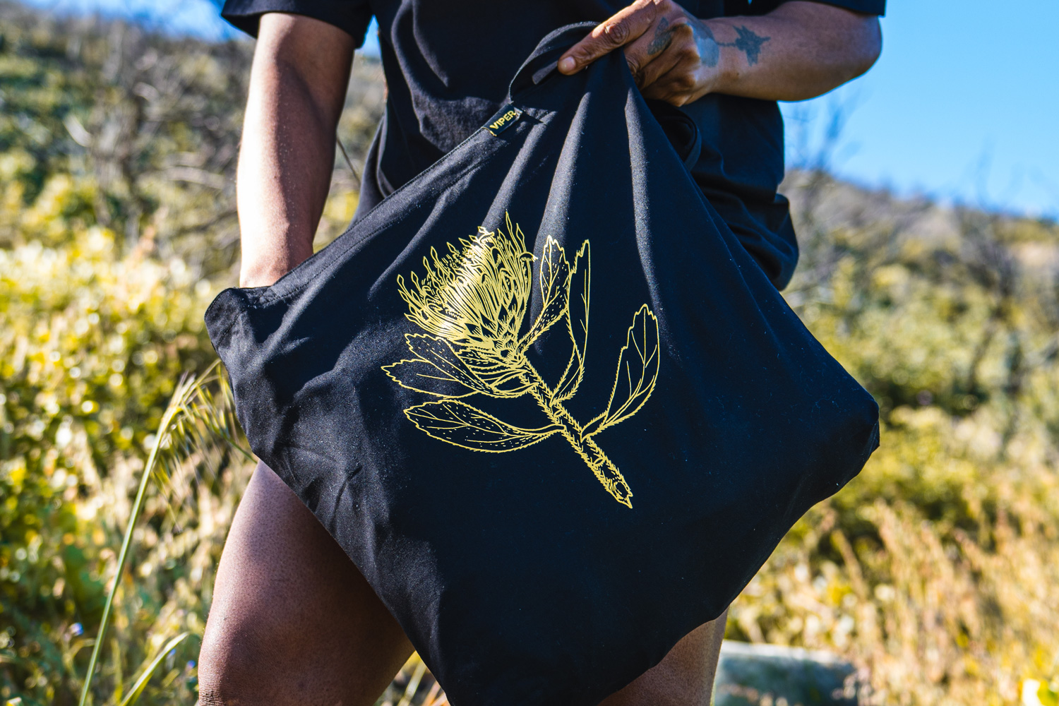
Apparel provided a great platform for creative expression. Looking towards local inspiration, proteas and the pincushion in particular stood out. Celebrating the brand’s home in Cape Town with an indigenous plant illustration.
Continuing the brands use of ‘sunshine yellow’ maintains the recognition with an existing audience. Yellow evokes a sense of creativity, confidence, and clarity. It is friendly while simultaneously being attention-grabbing.
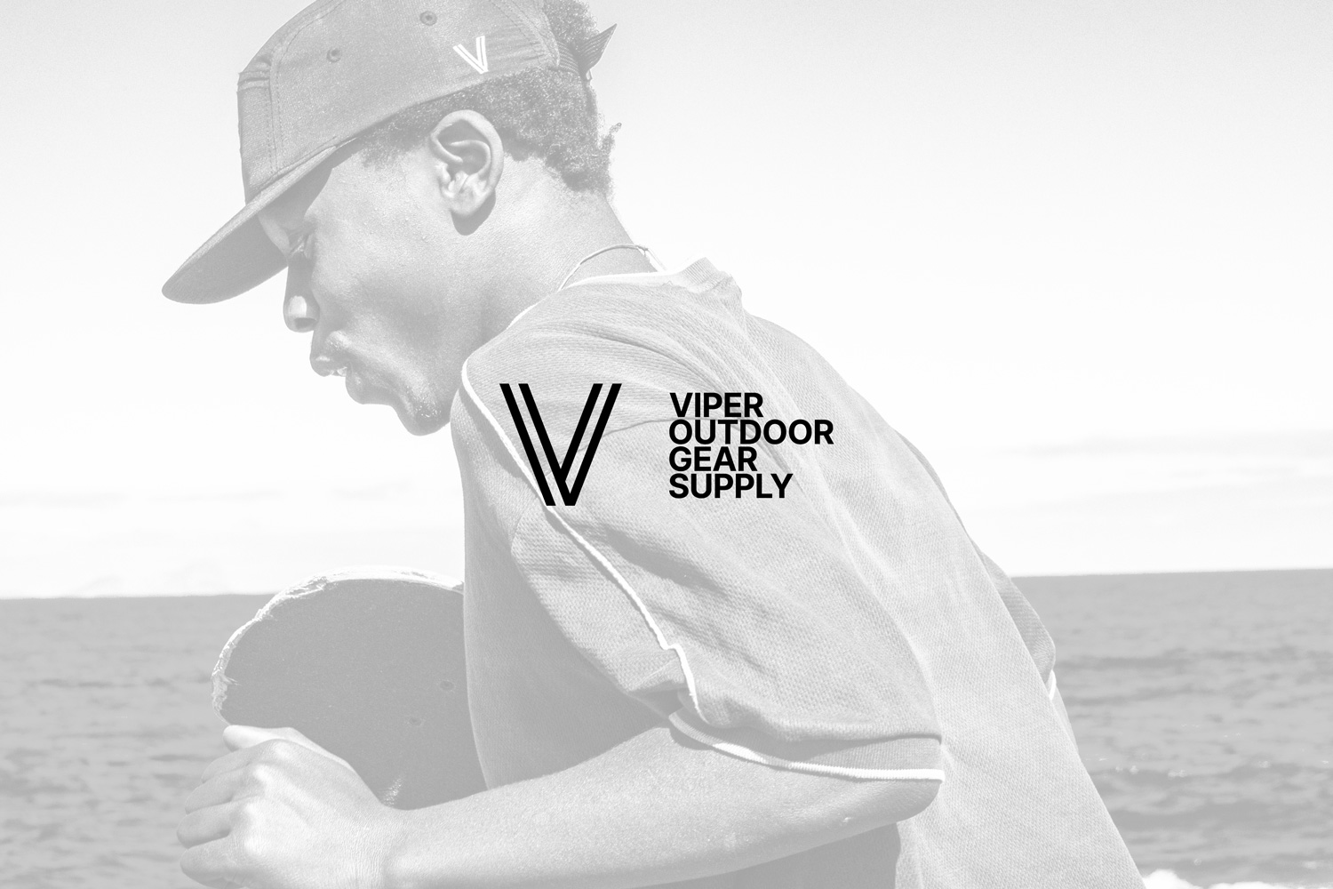
The Birth of Viper Outdoor Gear Supply
Adjacent to the rebranding of Viper Slacklines was the formation of a parent company, Viper Outdoor Gear Supply. This marks the beginning of a larger goal, to provide functional and long lasting products that support the outdoor lifestyle slackliners live.
Leave a Reply
You must be logged in to post a comment.